
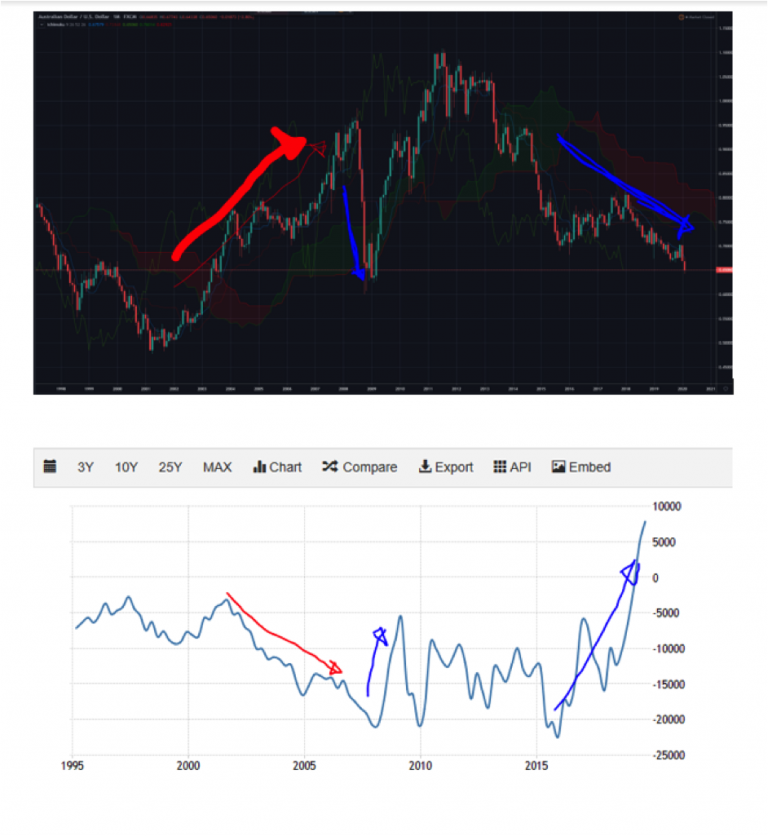
AUD/USD Monthly Candlesticks & Ichimoku Chart (Top) & AUD Current Account (C/A) Balance (Bottom)
The conventional economic theory is that currency strengthens when C/A surplus increases. In my career, I’ve observed this to be untrue for AUD. The times when C/A deficits increased (2002 onwards), many market observers were bearish AUD and took it as a sign that AUD should be lower. However, AUD powered ahead relentlessly. In 2008, the pattern was repeated both on the weakening and rebound of AUD. Since 2015, C/A deficit has been narrowing and the currency has been weakening. I have no clue if it is correlation, causation or coincidence. It could just be economic data causing all the fundamentalists having the wrong position in AUD or the currency causing the C/A moves. I’ll leave the explanations to the experts on theory. The C/A became positive in the last two quarters, and the charts look bearish (per last week’s chart). The observation has worked for me in the past, so I’ll keep doing what’s worked until it doesn’t!
Source: tradingview.com
Source: tradingeconomics.com
Vee, our Founder/CIO highlights patterns/formations on selected chart(s) every week which may have the potential to turn into trading opportunities. These charts are first sent out on Monday of the week to the TRACKRECORD COMMUNITY which helps them to filter out the noise and condense only what’s important in the markets for the week ahead.
Disclaimer: The views and opinions expressed in this material do not constitute a recommendation by TrackRecord Pte. Ltd. that any particular investment, security, transaction or investment strategy is suitable for any specific person. No part of this material may be reproduced or transmitted in any form or by any means, electronic, mechanical, photocopying, recording, or otherwise, without prior written permission of TrackRecord Pte. Ltd